
According to the filing, Lipnik has been fired from Apple “for failing to follow Apple’s policies designed to protect its confidential information, including development devices and unreleased software and features.” The filing also accuses Lipnik of failing to report “multiple prior breaches” to Apple.
When you sign an NDA (non-disclosure agreement), you’d best protect the secrets. Then again, the guy who left an iPhone 4 in a bar didn’t lose his job. Wonder what the differences are between them.
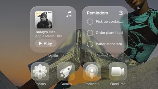
Gross. Why in the world would anyone want translucent icons?
Yes I’d like to strip away my ability to quickly sort mentally by color and I’d love it if there was a background image partially visible intermixed with the thing I’m looking for. Windows phone was peak UI. I don’t think transparency even needs to be a thing in an OS.
Transparency is fine if it’s used for stuff like the background of a window, since you’d want tod emphasize that anyways but I have to agree that using it for icons hurts usability so much.
Microsoft changing Outlook from gold to yet another blue blob. Google changing every single goddamn app to use the same red/yellow/green/blue pallet. And now this bullshit.
I mean, outlook has themes… but I generally hate their other recent UI changes.
The icons in the article aren’t even the default behavior. Mine all still have color. At least on the home screen and app drawer. The control center icons are translucent but those barely had any style before. And crucially, wifi, bluetooth etc buttons still have color to indicate status.
I’ve unironically seen both positive and negative reactions from people.
There’s an argument that increasing friction can help people addicted to their tech not get pulled in. Lots of apps designed to do that popping up with hard time limits and locks the last few years. Apple and Google are definitely aware that their design choices put them in the crosshairs at schools and employers. These sort of things pass the buck back.