

This is probably going to seem wildly low-effort compared to my usual posts here, but I’ve found a bit of a treasure trove of print media gaming ads from magazines and sites. And they’re amazing. I found it so fun to see what companies used to do to promote their games.
Things have clearly changed a lot over time, some of them are insensitive or even outright sexist, but if you just look at it through a lens of being a time capsule, it’s fun.
This one’s going to be very image-heavy. If you’re using Boost on iOS then you might struggle to scroll through this (or maybe not? It’s happened with all my other posts though, so you’ve been warned), if that happens just visit using your browser :)
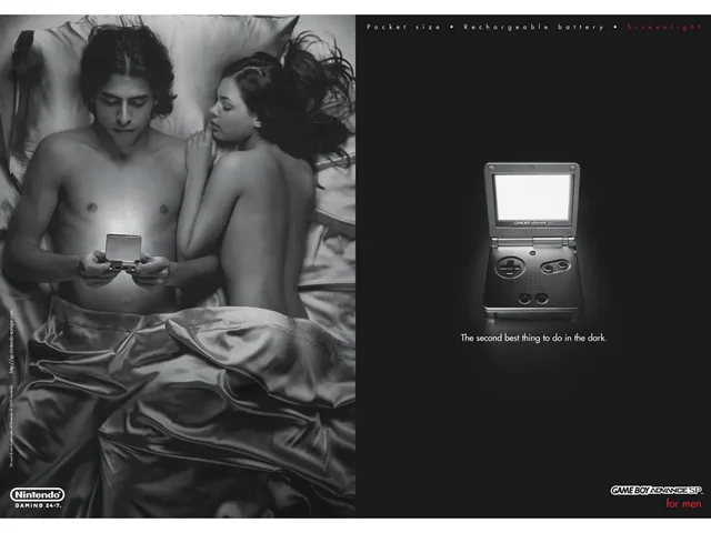
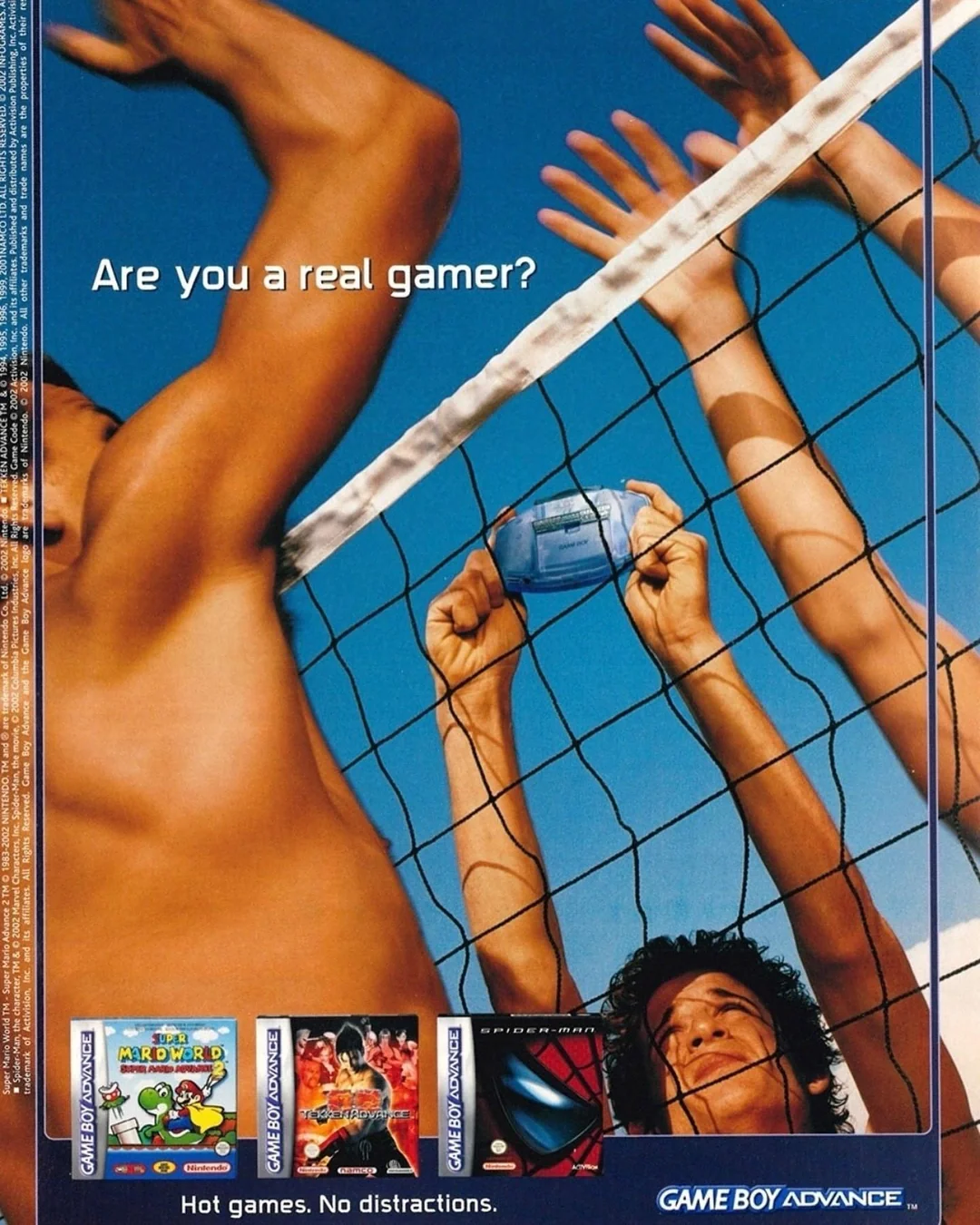
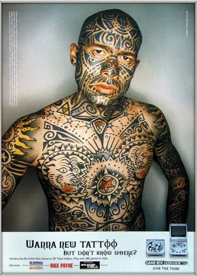
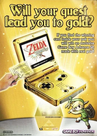
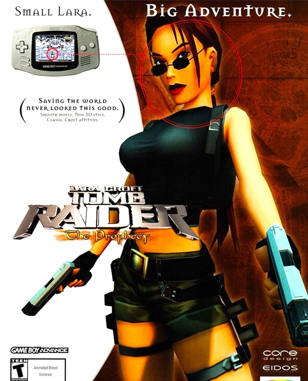
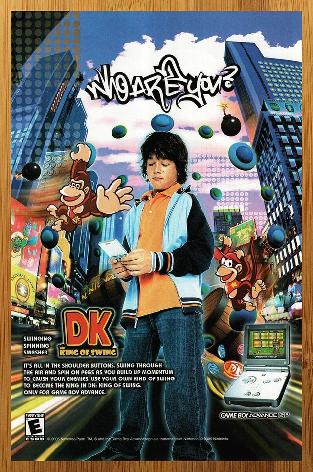
Game Boy Advance/SP:


The ‘feet’ collection were from an ad company in Stockholm, in 2005. I think it is to mean you’re using hands to play the GBA, and only have feet left to use for real life:


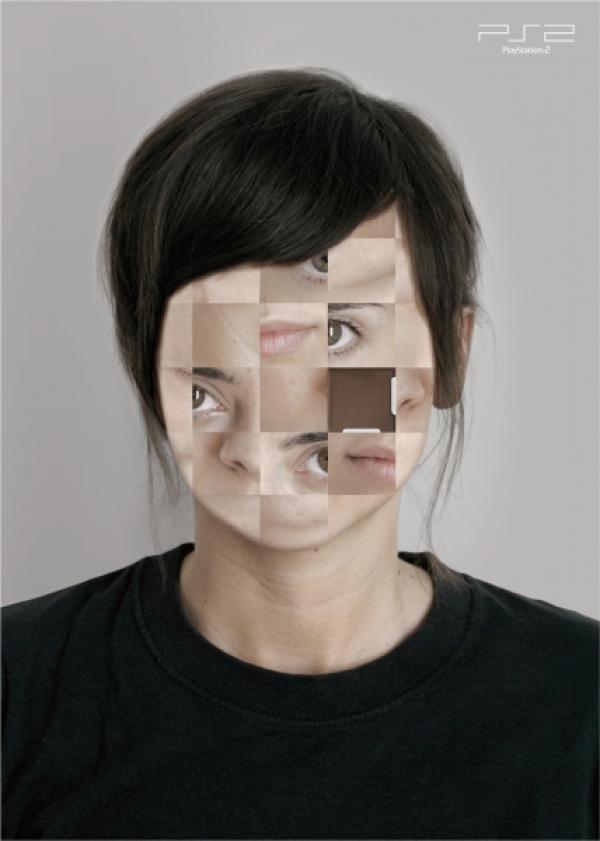
PS2:


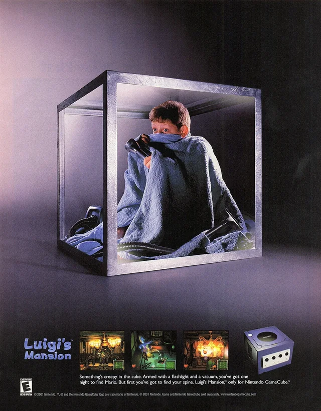
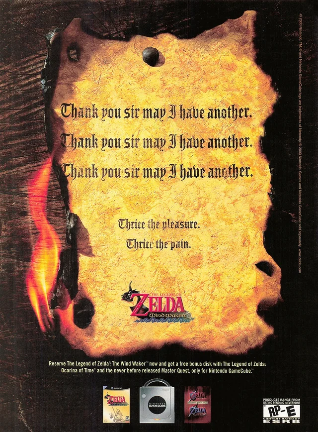
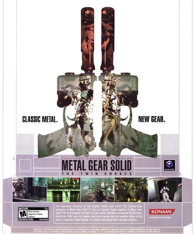
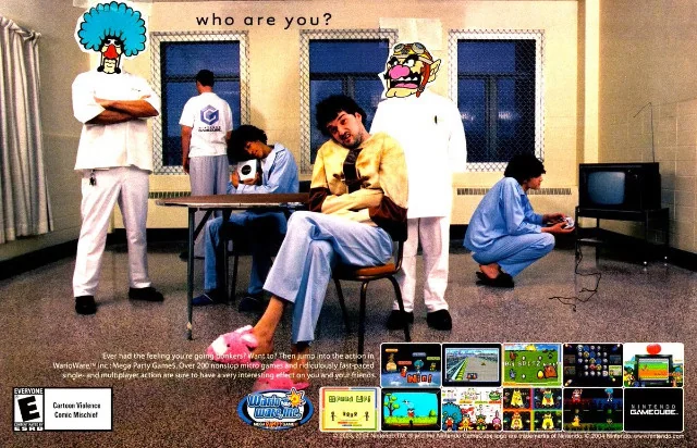
Nintendo Game Cube:


And that’s that! Just interesting to see a time when gaming was a little more experimental and edgy.
See they should have done a Charlie’s Angels type thing, have them standing kind of back to back like they’re on the same team. But I guess that won’t have been as controversial.
I think they were trying to lean too hard into the warring gamers battling it out, and the black woman represented the original PSP while the white woman represented the new white PSP, player 2.
But they put it on a fucking billboard where the only context we have to go by is beating the shit out of a black chick. What they fuck did they expect people to think?